In today’s business scenario where data plays an important role to drive customers, create strategies etc., organizations put their best effort to collect raw data sets from various sources such as company website metrics, corporate repositories etc. However, the data sets the organizations collect are of no use if they don’t provide real value. This is where the importance of data visualization is felt by the organizations.
Data visualization is the process of converting raw data sets into valuable information through different visuals. As the data visualization involves visual representation of data, the viewers can understand the information you’re trying to convey more easily and quickly.
However, your team may not always have access to the right tools always to convey the right meaning of the data sets due to which they may miss insights valuable to the business. But when you have knowledge about visualization types, you can pair them with the right business intelligence tool making it easier for you to represent your data sets in a meaningful manner.
When it comes to data visualization, everyone prefers the map to other data visualization types. But having geographical data with you does not always mean the use of maps. Like other types of data visualizations, maps are also designed to serve a purpose. There are various types of maps; you can create choropleth maps, heat maps etc. Before creating any map, you should make sure what story you are trying to tell your viewers or what the viewers are will try to find out.
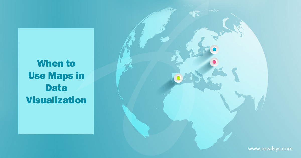
Mapping with points
Mapping with points may be the simplest way to get started. However, it makes sense if –
- The data refers to specific locations
- Users want to know things such as how local schools perform near a certain point etc.
- The map offers a clear distribution of the points such as fast food vans that are failing to maintain hygiene near a stadium.
Mapping with points doesn’t make any sense if-
- If the data represents large areas
- Users don’t require a map to search for a relevant location
- The story is about comparison and not about visible distribution
Using shapes
To indicate a value, you can use size or shape. Though shapes are appealing to play with, most often it adds nothing to your story. People use shapes for the points they use on the maps due to the fact that they can use it not because the shapes make the story clear.
When you use shapes, make sure that-
- The shapes don’t repeat the same information as the color you use
- The shapes tell the story
- The shapes make it easier for the users to navigate the map
- It should be recognizable instantly
Using size
Changing size based on a category or value is the third way of customizing markers. You should be very sure it that it does add much information and make the story unclear. When you change the size of the marker, it normally indicates the amount. It’s good to use a semi-transparent color for the marker so that the markers underneath are clearly visible.
Heatmaps
Heatmaps are used to show the intensity of the occurrence of something, not the location. The map in which you want to show merely distribution, heatmaps are useful.
![]()