What is a Maps-Based Data Visualization Tool?
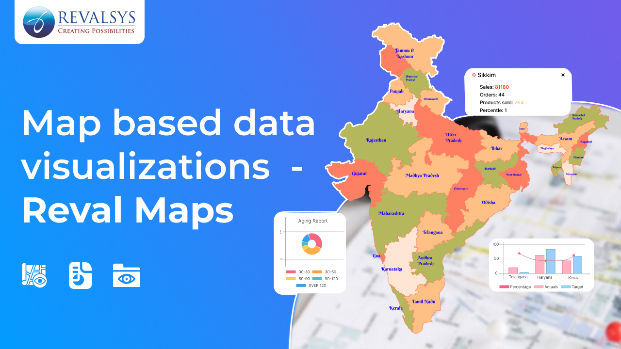
Data is the lifeblood of decision-making in modern times, and its visualization is the real game-changer. Maps-based data visualization tools combine geographical information and analytics, making it easier to understand data in a spatial context. Whether tracking logistics, analysing sales regions, or studying environmental impact, these tools transform raw data into actionable insights. Let’s dive deeper into this technology to understand the significance, features, applications and benefits of this technology.
Understanding Maps-Based Data Visualization Tools
A maps-based data visualization tool is the software or platform that overlays data points onto maps. By integrating geographic information system (GIS) technology with analytics, it helps users visualize data in real-world contexts. The tool converts complex datasets into maps, making patterns, relationships, and trends more intuitive and comprehensible.
For example, a retailer can see which regions generate the highest sales or pinpoint underperforming zones. Similarly, a logistics company can track its fleet’s movement in real-time or visualize delivery density across different regions.
How Do These Tools Work?
Data Integration
The tool collects data from various sources, such as Excel sheets, databases, APIs, or IoT devices. Data fields like location coordinates, demographics, and performance metrics are mapped for visualization.
Mapping Data Points
Geographic data (e.g., latitude and longitude) is used to place data points accurately on the map. This enables visual representation across countries, cities, or even pin codes.
Interactive Visualization
These tools provide features like zooming, filtering, and drilling down, helping users explore data in detail. For instance, clicking on a region might show sales performance, customer demographics, or operational statistics.
Analytics and Insights
Advanced tools incorporate algorithms for trend analysis, heatmaps, clustering, and predictive analytics. For example, a heatmap might show high-demand zones for a service, allowing better resource allocation.
Key Features of Maps-Based Data Visualization Tools
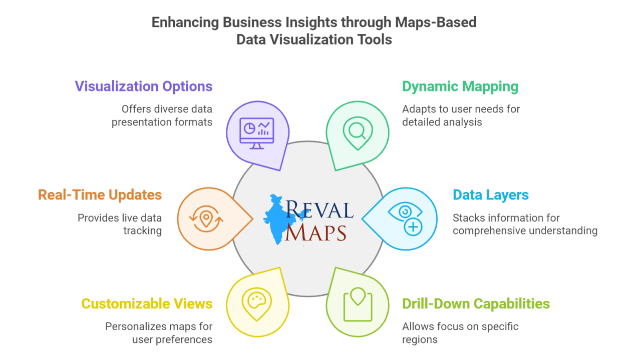
 Dynamic Mapping – Maps in these tools aren’t just plain images, they adapt and respond to your needs. For instance, if you’re viewing the sales performance of an entire country, you can zoom in to focus on a single state or even a district. It’s like peeling an onion layer by layer until you see the specific data you want.
Data Layers – Imagine stacking multiple sheets of transparent paper, each with different information, over a single map. One layer might show population density, while another could display sales data. Together, they give you a complete picture, like understanding why a high-density city is your top-performing region.
Drill-Down Capabilities – Let’s say your company is performing well in Maharashtra. With drill-down features, you can narrow your focus to Mumbai, Pune, or even individual pin codes to find where your strongest markets are or where there’s untapped potential.
Customizable Views – These tools let you personalize your maps. Whether you want to highlight key cities with custom icons, color-codes regions based on performance, or annotate important areas, you can tailor the visualization to suit your preferences.
Real-Time Updates – Ever wondered how food delivery apps show real-time delivery tracking? That’s the power of real-time updates. Maps-based tools bring similar capabilities to businesses. For example, a logistics company can track its vehicles live on the map and take immediate action if delays occur.
Visualization Options – Not all data should look the same. These tools offer different formats to visualize your data. Heatmaps, for example, can show which areas are “hotspots” for your business, while bubble charts can show city-wise revenue sizes. The variety ensures you can tell your data’s story effectively.
Real-World Uses of Maps-Based Data Visualization Tools
Business and Sales Analysis – Imagine you’re a retailer operating in India. A map-based tool can show you where your products are selling the most – say, higher demand in metro cities like Delhi, Bengaluru, and Mumbai. You can then allocate more inventory to these cities while focusing marketing efforts on underperforming areas like Tier-2 or Tier-3 towns.
Supply Chain and Logistics – Picture managing a fleet of trucks transporting goods across India. A map tool can show you their live locations, suggest the best routes to avoid traffic, and highlight areas where deliveries are delayed. It’s like having a virtual assistant that ensures smooth operations.
Healthcare – During events like the COVID-19 pandemic, maps-based tools became essential for tracking virus spread. Hospitals use these tools to locate underserved regions, ensuring ambulances and medical supplies reach where they’re most needed.
Environment and Sustainability – Environmentalists use maps to monitor deforestation in the Western Ghats or air quality in Delhi. With visualization tools, they can highlight problem areas, track changes over time, and push for targeted interventions.
Disaster Management – When natural disasters like floods hit Assam or cyclones affect the eastern coast, maps-based tools help authorities quickly identify the worst-hit areas. Relief efforts can be planned efficiently, ensuring timely help reaches affected people.
Education and Research – Universities and researchers use these tools to analyze trends in various fields. For instance, an economist might study poverty distribution across India, while a climate scientist could map rainfall patterns during monsoons.
Benefits of Maps-Based Data Visualization Tools
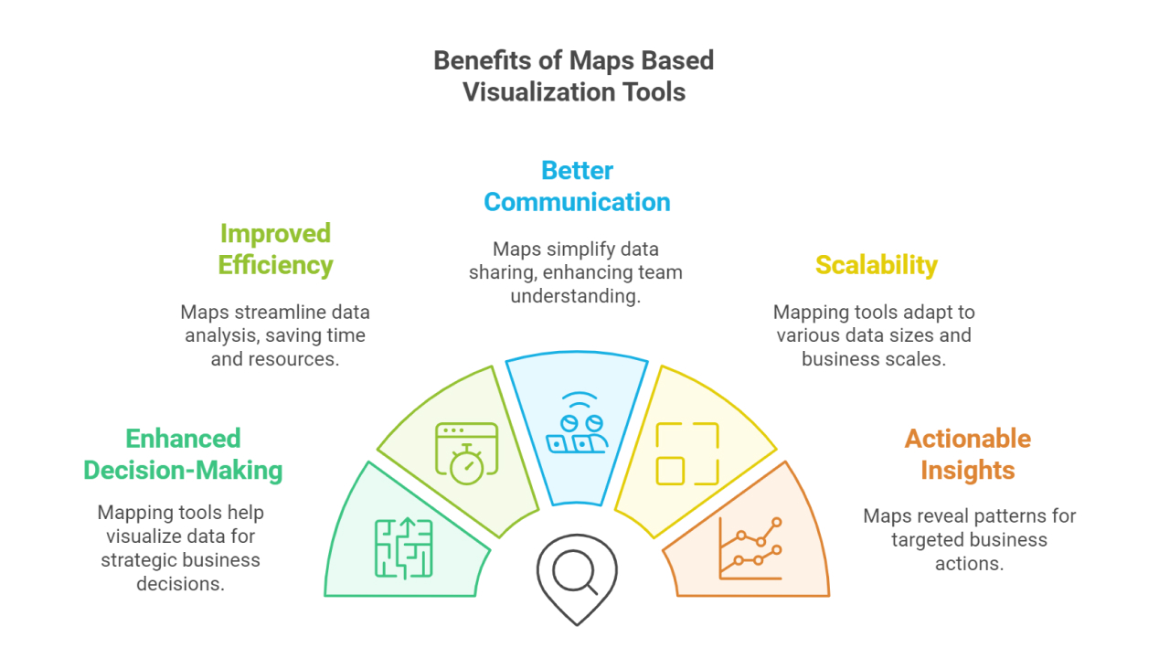
 Enhanced Decision-Making – Data in rows and columns can be confusing. When the same data is plotted on a map, it tells a clear story. For example, seeing sales patterns on a map can help a business decide where to open its next store or launch a new campaign.
Improved Efficiency – Instead of poring over endless reports, a quick glance at a map can reveal which regions need attention. Whether you’re managing logistics, marketing, or resources, this efficiency saves time and effort.
Better Communication – Sharing insights from a map is easier than explaining raw data. For instance, showing your team a map of cities with declining sales immediately sets the context for brainstorming solutions.
Scalability – Whether you’re running a local business in Gujarat or managing a nationwide operation, these tools scale effortlessly. They handle small datasets like local store sales and large datasets like nationwide supply chain metrics.
Actionable Insights – Maps reveal patterns that are hard to spot in spreadsheets. A heatmap showing high footfall areas can guide where to set up promotional events or new branches.
User-Friendly Interfaces – Most tools are designed for ease of use. You don’t need to be a tech expert to interact with these maps. Drag, drop, click, and zoom – the tool does the heavy lifting.
Real-World Examples
Retail Performance – A retail chain uses a maps-based tool to see how its stores are performing in different areas. It shows that sales are higher in big cities because the stores are in busy locations, while smaller towns have fewer customers. By zooming into the map, the company finds that these towns don’t have enough stores or marketing campaigns. With this information, they decide to run promotions and open new stores in these areas to attract more customers.
E-Commerce Business – An online seller uses a maps-based tool to track where orders are coming from and being returned. The tool shows that orders are strong in some areas, but returns are high in others due to delivery delays. The seller uses the map to find which delivery routes need improvement and works with logistics to fix the problem. This helps the business deliver faster and make customers happier.
Logistics and Supply Chain Management – A logistics company monitors its fleet and delivery efficiency using maps-based tools. The map shows frequent delivery delays in certain regions, and a heatmap identifies areas with poor road conditions. Additionally, the tool provides real-time updates with provided data on vehicles stuck due to weather or roadblocks. Using this information, the company re-routes vehicles, plans better schedules, and enhances delivery efficiency in challenging areas.
Choosing the Right Map-based visualization Tool
Selecting the right maps-based visualization tool, like RevalMaps, ensures you can effectively visualize and analyze your business data. Here are some key factors to keep in mind:
Data Compatibility and Integration
RevalMaps is designed to seamlessly integrate with your existing data sources, whether they come from ERP systems, CRMs, or spreadsheets. It supports multiple formats to ensure your business data is ready for visualization without extra hassle.
Scalability for Growing Business Needs
As your business grows, so does your data. RevalMaps is built to scale, handling increasing volumes of data effortlessly while maintaining performance, ensuring it remains a reliable tool for your analysis needs.
Tailored Customization Features
RevalMaps offers a range of customization options to adapt maps to your specific business requirements. From selecting the geographical granularity (state, district, or pin code) to choosing visualization styles, you have the flexibility to design maps that align with your goals.
Real-Time Data Insights
For businesses requiring up-to-the-minute information, RevalMaps supports real-time data visualization. It enables you to monitor trends and make quick decisions, whether you’re tracking sales or logistics.
User-Friendly Interface
RevalMaps is designed with simplicity in mind, ensuring that users from all levels of expertise can navigate the tool without steep learning curves. This reduces onboarding time and increases productivity from day one.
Future of Maps-Based Data Visualization
The future of these tools lies in the integration of AI, machine learning, and IoT. Imagine predictive analytics suggesting optimal store locations or AI-driven insights identifying underserved markets. Additionally, augmented reality (AR) might allow users to interact with 3D maps, making data exploration even more immersive.
Conclusion
Maps-based data visualization tools are transforming how we understand and interact with data. They bridge the gap between numbers and real-world insights, empowering businesses, governments, and researchers to make smarter decisions. Whether you’re optimizing sales strategies, improving logistics, or planning cities, these tools provide a powerful platform for data-driven success. Embrace the power of maps and unlock a new dimension of understanding.
