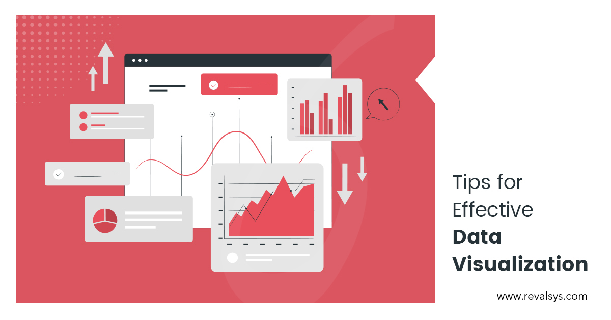
In this world of business where data really matters a lot, effective data visualizations play an important. The data you present is best only when it is understood easily. A key to a successful marketing strategy is using data visualizations to convey facts. When you know how to use data visualizations effectively, you’ll mean the difference between whether you’re offering information overload or value to your customers.
Let’s check some helpful tips for effective data visualizations:
• Use good data
As the data visualization is based on the input data, you should make sure to use the right data that is meaningful to the viewers. Good data are those that include accurate, valuable, meaningful and concise statistics.
• Tell a story
When you use data visualization, it should tell a story. No matter you use graphs, charts or maps to present your data, it should attract the attention of the readers. It should provide a boost to the message you want to convey to your readers.
• Choose the right visualization
Choosing the appropriate graphics to present your data is vital for effective data visualizations. As data visualization is an attempt to make data easily understandable and those too accurately, make sure that you use the right method, be it pie charts, bar graph, map etc. So, you should know well the purpose of data visualization in your case. If you want to compare data, you can use bar graphs. You can use line graphs to present statistics over a period of time, pie charts to present portions of data of a whole and so on.
• Keep it simple
Over-designed, complicated and too many data in visualizations don’t serve the purpose as viewers won’t be able to understand easily what you’re trying to convey. The chart type you use should be simple and easily interpretable. Make sure not to use things such as 3D images on a flat plane, too much colour etc. Then only the human brain can process visualizations more quickly and effectively. While keeping it simple, you can cleverly use some design elements to enhance the data and message.
• Use colour judiciously
Colour perception is a tricky thing. You can take advantage of the colours reflecting your brand identity which your users can strongly associate with. You can use a dark colour to highlight a certain part of your data and attract the attention of your users to the highlighted part. Use a colour scheme that complements your visualizations.
• Organization is the key
The effectiveness of data visualization depends on the way it is organised. Disorganized visualization leads to unappealing visuals and incorrect data interpretation. It should be simple as well as organised so that the viewers receive the information you want to communicate.
• Label the data
To describe your statistics, figures and message, it’s necessary to label your data visualization. Provide information so that it becomes easier for the reader to comprehend the data. You can provide title, headlines etc. to make the visual communication easier.
![]()