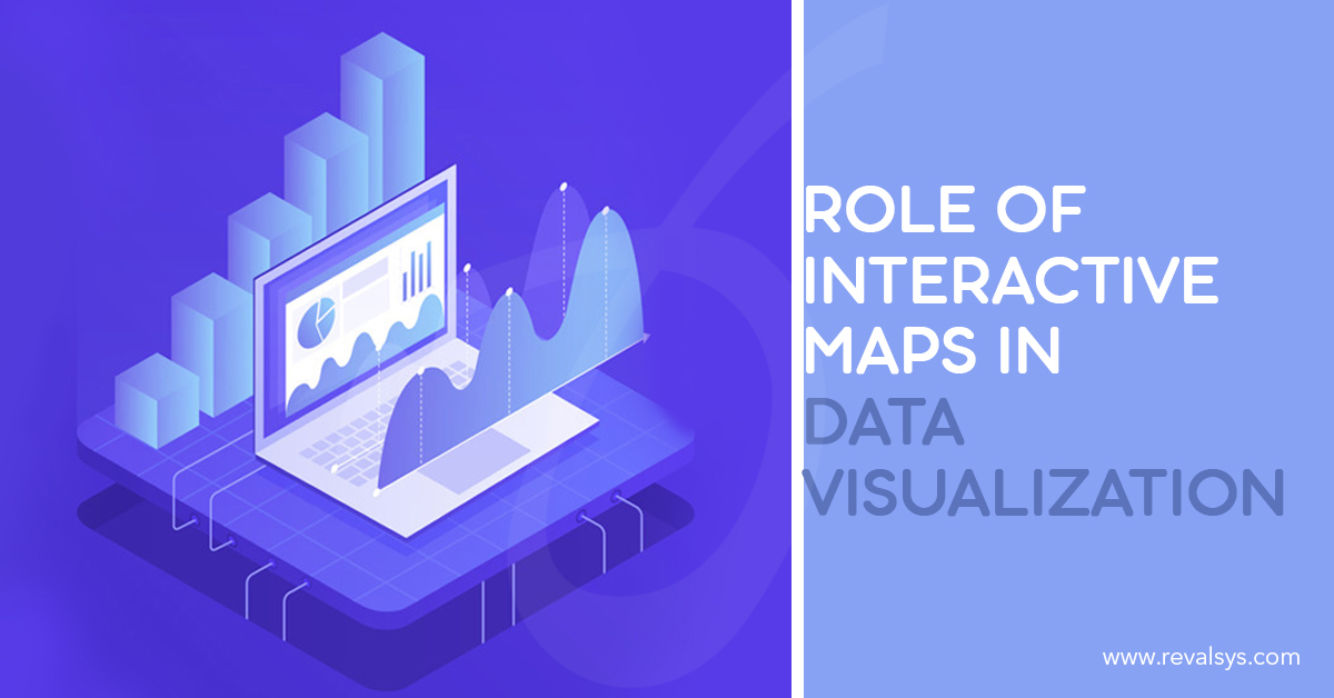
Interactive data visualization not only allows you to see information in an easy, interesting and compelling format but also allow you to interact with the information in a visual manner. It helps in uncovering new and useful insights. The power of interactive data visualization is best understood only when you immerse yourself itself in it.
What do you mean by interactive maps?
Interactive maps are web-based tools flexible enough that make the presentation of data simple to the user. Such maps have clickable points that display detailed information when clicked. No matter your data is straightforward or relational, singular or hierarchical, interactive maps will organize the data into location-specific information.
Interactive Maps’ Role in Data Visualization
Your organization may have loads of data about its performance in different locations. But it doesn’t make any sense if the data don’t offer any value. When you communicate the data visually making it easier for the audience to derive the message or information that the data conveys, the data about your organization’s performance in various locations will actually make sense.
However, visualizing such data through bar graphs, treemaps, pie charts etc. will not be sufficient to drive actionable insights, pinpoint the factors responsible for slow-down or to know why some locations are doing well and why some are not. To make the business better, your company should do well in all the locations. You should have a clear understanding of the factors responsible for better business.
This is where interactive maps step in. Interactive maps are a great way to handle data and offer situational and contextual data visualization in real-time. Let’s check how your company can be benefitted with interactive maps:
• Make easy data exploration
Data is valuable only when people who are responsible for identifying patterns can use it to the optimum. When the data is enormous, it becomes a tedious task to do things such as understanding the variables that require attention, keeping track of key performance indicators etc. Using interactive maps, you can present data in a way making easier to identify, locate, format and communicate information effectively. With visual navigation, even a novice user can identify patterns, find correlations etc. It makes the decision making process simpler.
• Offer clear and concise information
When you use interactive maps while visualizing your data, you can provide information in related groups and that too more clearly.
• Allow you to create a story
When the audience gets the information in the form of a story, it becomes easier for them to understand the complex data. They can map pins, plot data points, select and filter data elements, create text hovers, modify etc. As the data gets consolidated in an interactive map, the information required is presented based on the preferences of the users. The story created is based on the context and offers a bird’s eye view to the audience.
• Let to you make timely decisions
Updating and offering information in real-time is just a matter of seconds. With fresh information, you can make well-informed and timely decisions even in complex situations.
• Let you derive correlation
Based on multiple data sets, users can identify pattern and trends, locations that require attention and know dynamic relationships.
• Help drive processes
Interactive maps allow the users to know the key performance indicators and to accomplish the KPIs they can use colour-coded information to represent each phase.
• Offers easy collaboration
As the most interactive maps are cloud-based, multiple users can view or update maps at the same time. In addition, the facility to update information in real-time leaves no inconsistency while viewing the map from different places.
• Find out the progress
When you use interactive maps, you can track metrics based on regions as the information you get are based on locations. Rather than taking a common approach, you can create strategies that are location specific.
![]()