What is data visualization?
The presentation of data in graphical or pictorial format is referred to as data visualization. Data, when presented visually, enables decision-makers to identify new patterns and grasp complex concepts. The concept of data visualization is taken further with interactive visualization. It allows you to use technology to drill down into graphs and charts for more details.
For business users, one of the biggest challenges is to decide which data visualization they should use so that the data is represented most effectively.
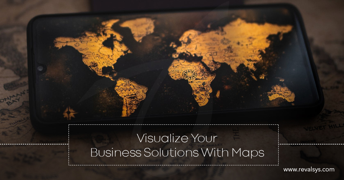
Data Visualization through Maps
When you represent data visually through maps, it is referred to as map visualization. This area of data visualization is developing at a rapid pace that has various practical applications. Apart from looking beautiful, maps provide orientation and give context of the data you’re using.
Maps are perhaps the biggest sub-section of visualization types and are designed to serve a purpose just like the other types of data visualization. There are different variations of maps with its own strength. As maps are more interesting than other data visualization types, people prefer using maps for data visualization. However, having geographical data with you, not at all mean that you have to represent data through maps only. Apart from being great visuals that can engage the viewers immediately, representing data through maps can help you have better insights of important business context.
Here are some benefits of using maps to visualize data for your business:
• Multiple analysis perspectives
Presenting data through maps allow end users to understand information of particular value. With large data sets, it becomes quite a hard task, to do things such as keeping track of key performance indicators, the factors that require attention etc. When the users can identify patterns from the data sets and use those to the optimum, then only data is valuable. Decision-making process also gets simpler with data visualization via maps.
• Provide concise information
When you use maps for visualizing your data, you can offer information to your audience more clearly.
• Help you make decisions in a timely manner
As updating information in real-time takes just a few seconds, you can make well-informed decisions in a timely manner even in complex situations.
• Help you create a story
With the help of data visualization through maps, the viewers can derive the information in the form of a story allowing them to understand complex data in a much simpler way. The story that is created through data representation is based on the context that offers a bird’s eye view to the viewers.
• Help in establishing correlation
Based on multiple data sets, users can identify pattern and trends, locations that require attention and know dynamic relationships.
• Let you drive processes
Visualizing data via maps let the users understand the key performance indicators and accomplish those. The business processes get faster when the users can understand the vital factors influencing the business easily.
• Check the progress
With map visualization, you can track metrics based on regions. The information you get through such visualizations are based on locations. You don’t have to take a common approach to create strategies; the strategies you create will be location specific.
![]()