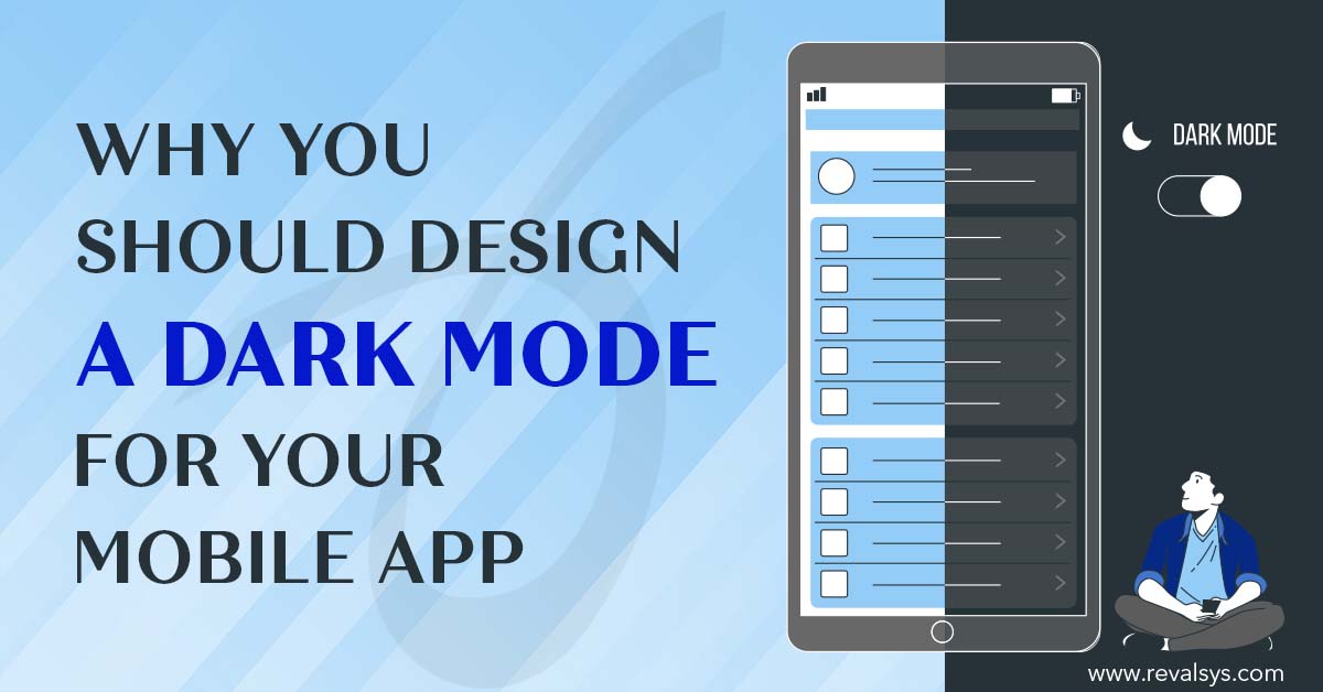
A dark mode is a low-light mode in which content features against a dark background colour. A mobile app’s mode switches when the dark mode is activated automatically or manually by the app’s users. The dark mode is different from the low brightness mode. The former changes an app’s theme and colours whereas the latter lowers the brightness of a device.
Incorporating a dark mode into your app has benefits for both you and your users. Take a look at them below along with tips to implement a dark mode on your app:
Reduces Strain On The Eyes Of Users
Mobile devices are used for both personal and official purposes, which means a high screen time for users. Checking their mobile phone is the first and the last thing that people do in a day. This puts a lot of strain on their eyes which affects their vision and gives them headaches. It is important to design apps in a way that makes the experience of using them a comfortable one for users.
The white background is too bright for the eyes. It emits too much light and is glaring, especially at night. It emits a blue light that is harmful to users and disrupts their sleep patterns. The dark mode helps to reduce the glare, making it easy for users to view the app. It also increases the legibility of the text. The dark mode is also useful in low light conditions and for people with low vision.
Gives Your App A Bold Look
A black background can make your content stand out and interesting. It creates a dramatic effect. This helps to improve the user experience of your app. Black background with text in white or other colours is a nice change for users from the usual white background.
Saves The Battery Life Of Phones
Devices with OLED or AMOLED screens consume less battery in the dark mode. The pixels in these devices work independently. This enables the dark mode to switch off the pixels that are not in use unlike the regular mode which keeps all the pixels on at all times. Switching to the dark mode can help people who use your app for work to use it for longer hours.
Helps You To Stand Out From Competition
The dark mode is an upcoming trend that companies of all sizes are gradually embracing. Introducing the dark mode in your app can stay ahead of your competitors – customers will choose you when you are constantly embracing new trends and offering new and exciting experiences to look forward to.
Things To Remember While Implementing The Dark Mode On Mobile Apps
Use Colour Sparingly
As you are designing the dark mode to reduce strain on the eyes, you must be careful not to use too many colours in this mode. Use colours to quickly grab attention to a few important bits of information or calls to action.
Use Your Brand’s Colours
A smart way to use colours in the dark mode of your app is using your brand’s colours. This helps you to improve brand recall. You can also tweak your brand’s colours to make sure they are compatible with the dark mode.
Use Shades Of Colours
While using colour, remember not to use bright shades as they affect your users’ vision. Use pastel colours and avoid using 100% black or white. The contrast of pure black and white is too high and causes discomfort to viewers.
Do Competitor Research
You must do competitor research in terms of both content and design while designing your mobile app. This will help you to avoid looking similar to other apps and easily get noticed.
Test The Dark Mode
Test the dark mode on your users and across devices and resolutions. Test its brightness, contrast, and low light visibility. Make sure that it is not making its users feel uncomfortable.
Enable Toggling Of Modes
Allow each user to use your app their way. While automatically changing the mode is a smart idea, allowing your users to toggle the mode themselves gives them a sense of freedom and control while using your app. This improves its user experience.
