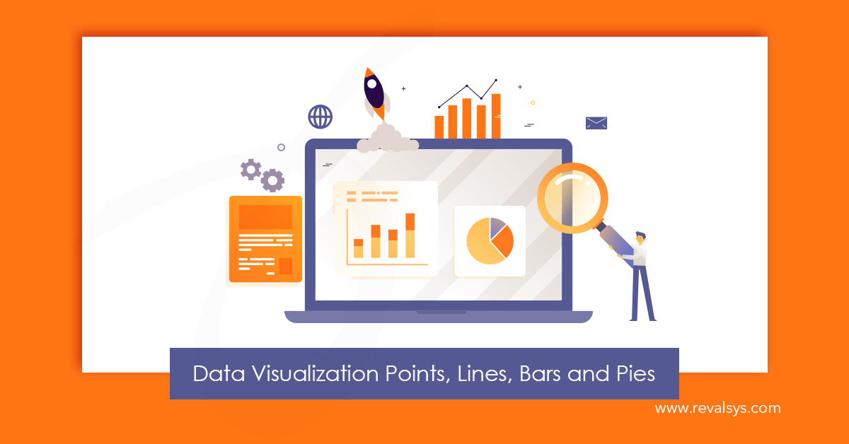
Data visualization is an attempt to make people understand the significance of data with the help of visuals. Data visualization is considered good when it communicates information succinctly and clearly through a combination of illustration, typography and colour. It should be visually accessible, approachable and interesting. By making use of visuals elements such as graphs, charts and maps, you can make it easier to understand trends and patterns in data.
Here we will discuss data visualization basics—points, lines, bars and pies.
• Points
The simplest data encoding object is none other than points. When you use points, it offers you a specific location and value in a graph. By using different shapes such dot, triangle, plus sign etc., you can distinguish different parts of your data. Points alone are an effective option only in a few cases. When both axes of a graph offer quantitative values, points can be used effectively. Such a graph is referred to as a scatter plot designed specifically to present a correlation between both the axes. It allows you to plot many values on the graph simultaneously.
• Lines
To see trends in time series data, lines are very much apt. Line graphs are used frequently to display trends and analyze how data has changed over a certain period of time. The journey of the line across the graph creates a pattern revealing the trends in a data set.
• Bars
For comparisons of categorical data, bar charts are appropriate. Bar charts are easy to read as it lets viewers see the categories that are largest and smallest immediately and get to know the differences easily. Bar charts can also be used for time series data such as comparing budget and actual expenses across a certain time period.
• Pie Charts
Pie charts are used to represent data as parts of a whole. When you limit the number of pies to not more than six, the pie chart becomes more effective. Too many thin slices are difficult to read. And if you have more than the mentioned slices, you can put the extra slices in a single group with the name ‘Other’. If the pies don’t present a meaning whole, using pie chart won’t be the right option. Avoid using a 3-D pie chart as it can make some slices of the chart look larger even if it is not so.
![]()